Choosing colours for an office: one accent, used well
Build the office palette from its materials first, keep the walls and large surfaces quiet, then choose one accent colour and use it in a few places where it does a job: guiding, marking or welcoming.
· Updated · 6 min read
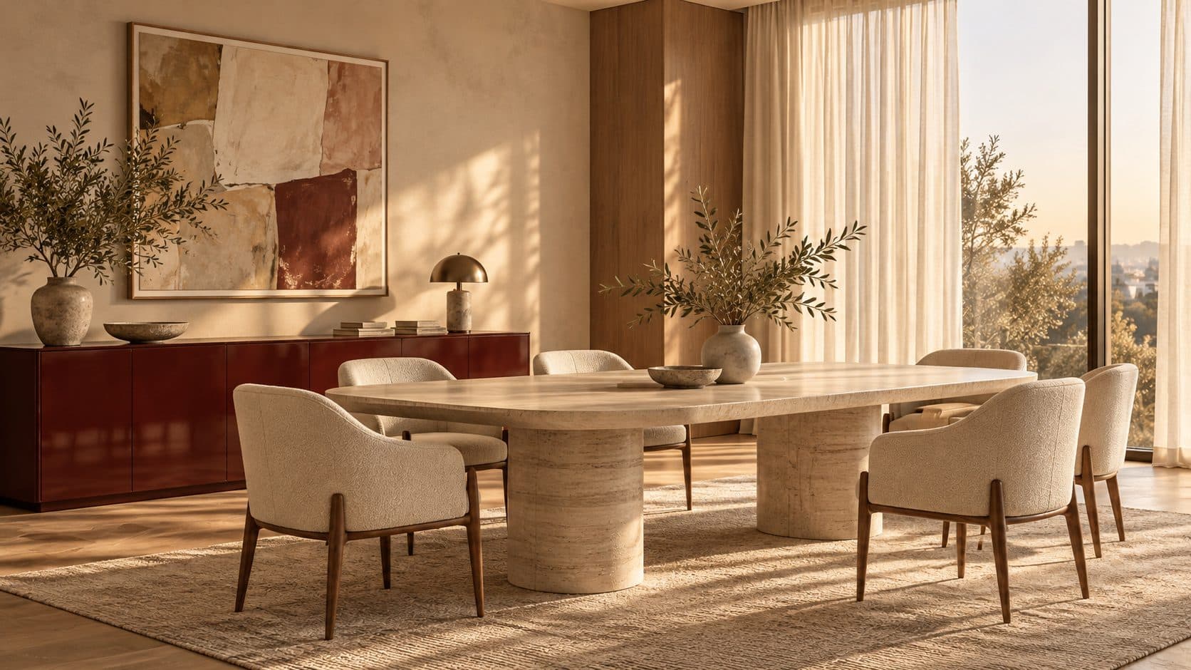
Illustration generated with AI. Not a POA project.
In this article · 8 chapters
- 01Why most office colour schemes go wrong
- 02Start with the materials, not the paint
- 03Choose one accent, and give it a job
- 04Brand colours: use them, but sparingly
- 05How Dubai's light changes colour
- 06Colour, durability and the end of the lease
- 07Planning colour as part of the whole design
- 08Frequently asked questions
A good office colour scheme starts with materials, not paint charts. Let timber, stone and textile set a calm base, keep walls and ceilings quiet, then choose one accent colour and use it in a few deliberate places: a reception band, a corridor wall, a pantry. One colour used with intent gives an office more character than five used everywhere.
Why most office colour schemes go wrong
Colour is usually decided late, once the layout is fixed and the budget is tight. Paint is the cheapest way to add personality, so it is asked to do too much: a feature wall in every meeting room, brand colours on every surface, a different shade per department.
The result looks busy on day one and dated soon after. It also competes with everything else in the room: the view, the artwork, the people. A calmer approach treats colour as part of the interior architecture, decided alongside materials and light rather than added on top.
Start with the materials, not the paint
The largest colour decisions in an office are not paint at all. They are the floor, the joinery, the desk tops and the ceiling. Choose those first:
- Floor. Stone, terrazzo, timber or carpet sets the tone of the whole floor plate, and it is the hardest surface to change later.
- Joinery and furniture. Oak, ash and walnut each bring their own colour, from pale and cool to deep and warm; our comparison of walnut, oak and ash for office furniture covers how each one looks and ages. Our materials guide for warm offices explains how to keep that palette short.
- Metal. Brushed steel, bronze or blackened metal for handles, frames and details. Pick one and repeat it.
- Textiles. Upholstery, rugs and curtains carry colour softly and help with acoustics at the same time.
Once these are chosen, the walls usually need to do very little. A warm white, a soft stone or a pale grey that sits well with the timber is often all a large office needs.
Choose one accent, and give it a job
The accent is the colour people remember. It works best when it is saturated, used in a small number of places, and each of those places has a reason.
Useful jobs for an accent colour:
- Guiding. A coloured ceiling line, a wall at the end of a corridor or a painted door frame draws people towards reception, the pantry or the meeting rooms.
- Marking. One colour for the doors of bookable rooms, or the inside of a niche in a shelving wall, helps people find their way without signs.
- Welcoming. A band in the reception desk, a lounge sofa or the back wall of the waiting area gives visitors a first impression. Our article on reception design covers what that first space needs to do.
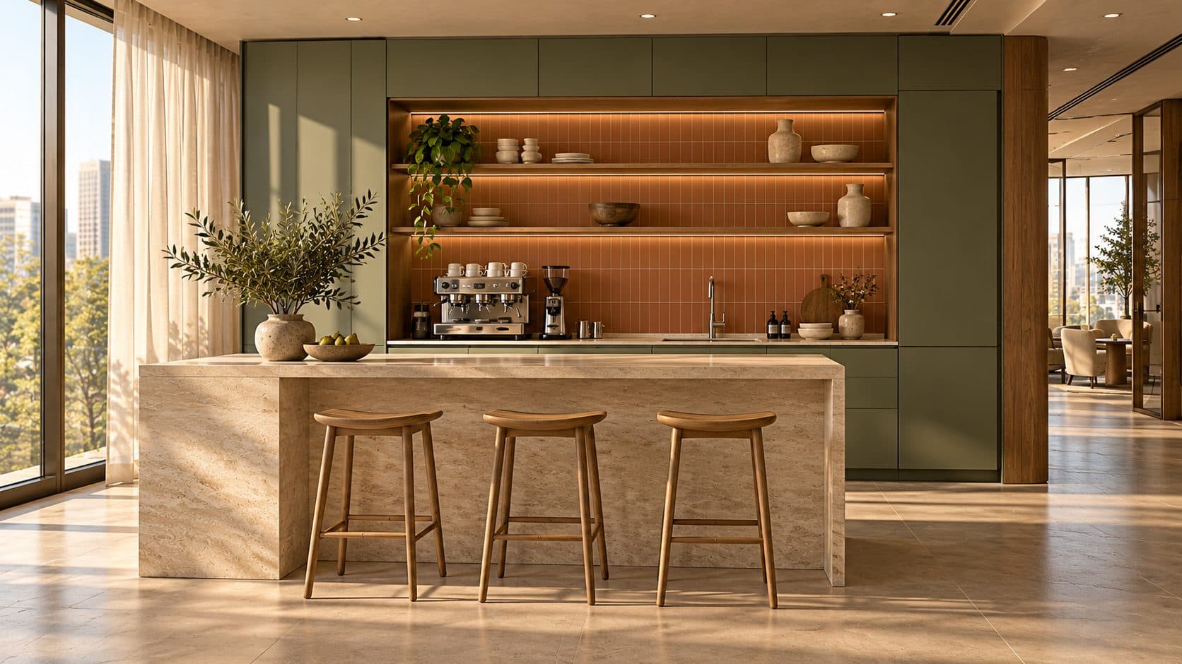
- Gathering. A pantry or social area can carry more colour than the desks, because people spend shorter periods there.
The corridor in the cover image, from our Cobalt Headquarters concept, shows the idea: oak, terrazzo, glass and steel throughout, with cobalt only in a niche, a ceiling line, an end wall and the door handles.
Brand colours: use them, but sparingly
Most companies arrive with a brand palette, and it is natural to want it on the walls. Brand colours were usually chosen for screens and print, though, and a full wall of a logo colour can feel loud at room scale.
A few ways to bring the brand in without turning the office into a showroom:
- Use the strongest brand colour as the single accent, and keep everything else neutral.
- Use a deeper or softer version of the brand colour, which often reads better on large surfaces than the exact print shade.
- Put the brand into materials and objects, such as upholstery, a lacquered desk or a rug, rather than paint.
- Let the logo itself be the brand moment at reception, on a calm background.
Bring your brand guidelines into the brief to your interior designer at the start, so the colour is designed into the joinery and furniture rather than painted on at the end.
How Dubai's light changes colour
Colour that looks right on a sample card can look very different on site. In Dubai offices, three things change it:
- Strong daylight. Rooms on a sunny façade wash out pale colours and can make saturated ones glare. The same paint can look warmer or cooler depending on orientation and time of day.
- Tinted glass. Many towers use tinted or reflective glazing, which shifts the colour of everything inside, usually towards green, grey or blue.
- Artificial light. The colour temperature and colour rendering of the fittings decide how timber, fabric and paint read after sunset. Our guide to lighting an office for Dubai's sun explains why a consistent white and good colour rendering matter.
The practical answer is to test. Paint large samples, at least an A3 board or a patch on the actual wall, and look at them in the morning, in the afternoon and under the installed lighting before you commit.
Colour, durability and the end of the lease
Colour choices also have practical consequences.
- Finish. Matt finishes hide wall imperfections but mark more easily; washable or eggshell finishes suit corridors, pantries and anywhere hands and chairs touch the wall.
- Lacquer and laminate. A coloured lacquered or laminate surface on joinery lasts longer than paint in busy areas, and can be replaced as a panel rather than repainted.
- Reinstatement. Strong colours on walls may need to be returned to the landlord's standard finish when you leave. Check your lease and read our article on make-good and reinstatement before painting large areas.
- Change. If the brand is likely to change, keep the accent in elements that are easy to replace: paint, upholstery and loose furniture rather than stone or built-in joinery.
Planning colour as part of the whole design
Colour works when it is decided together with the layout, the materials and the lighting, not after them. That is how we approach office interior design in Dubai: a short palette of natural materials, one accent with a clear purpose, and samples tested in the actual space. Where the accent lives in furniture, such as a lacquered desk or a coloured reception counter, it becomes part of our bespoke office furniture work.
If you are choosing colours for a new office or a refit, tell us about your space.
Frequently asked questions
How many colours should an office have?
Usually a calm base drawn from the main materials, such as timber, stone and a warm white, plus one accent colour. A second, quieter accent can work in large offices, but every extra colour makes the scheme harder to hold together.
What is the best wall colour for an office?
There is no single best colour, but most offices are well served by a warm white, soft stone or pale neutral that sits comfortably with the timber and floor. Test large samples in the actual room, at different times of day and under the installed lighting, before deciding.
Should an office use its brand colours on the walls?
Use them sparingly. The strongest brand colour often works best as the single accent in a few chosen places, such as reception or a corridor wall, while the rest of the office stays neutral so the brand does not feel like a showroom.
Why does paint look different in my office than on the sample card?
Daylight direction, tinted glazing and the colour temperature of the light fittings all change how a colour reads. Strong Dubai sun can wash out pale colours, and tinted glass can shift everything inside. Large on-site samples are the only reliable test.
Do I need to repaint coloured walls when my office lease ends?
Often, depending on the lease. Many make-good clauses require walls to be returned to the landlord's standard finish, so check the lease and confirm with building management before painting large areas in strong colours.